tell stories with data.
Each chart teaches
something new.
still figuring it out,
one dataset at a time.
Started at Sakal.
Now at IndiaSpend.
Still learning.


Always learning. If you want to talk data, maps or journalism, let's connect.
Send Email →
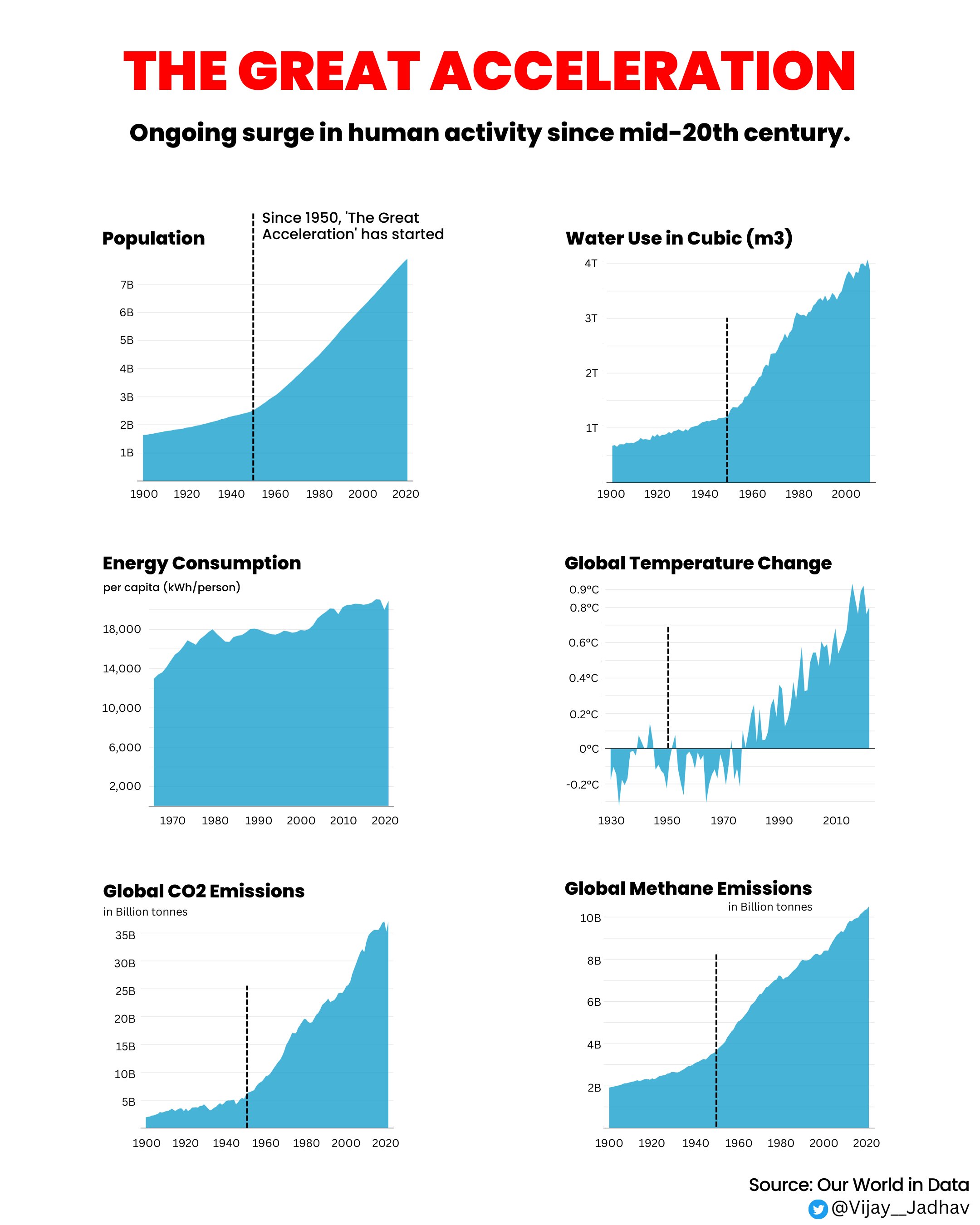
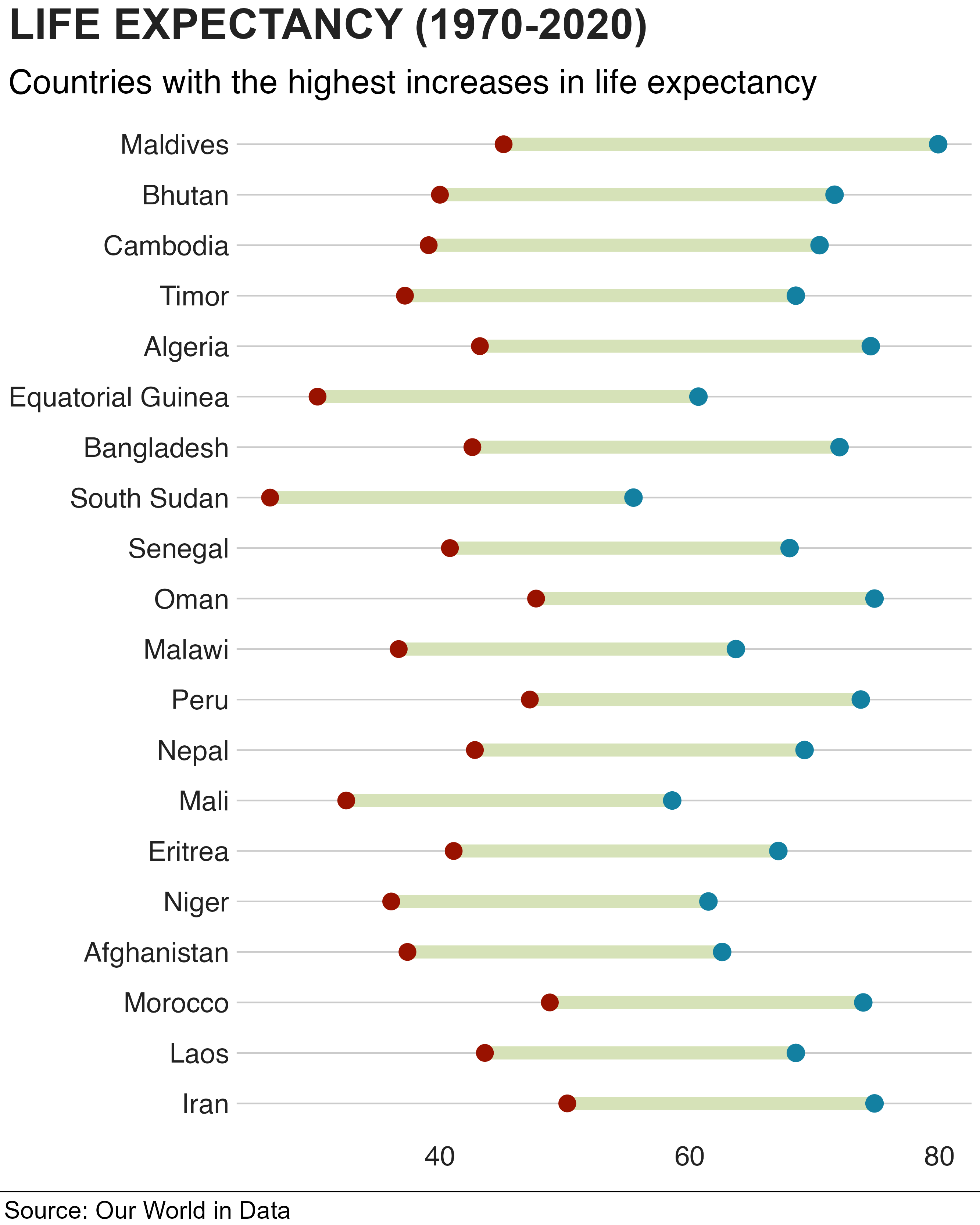
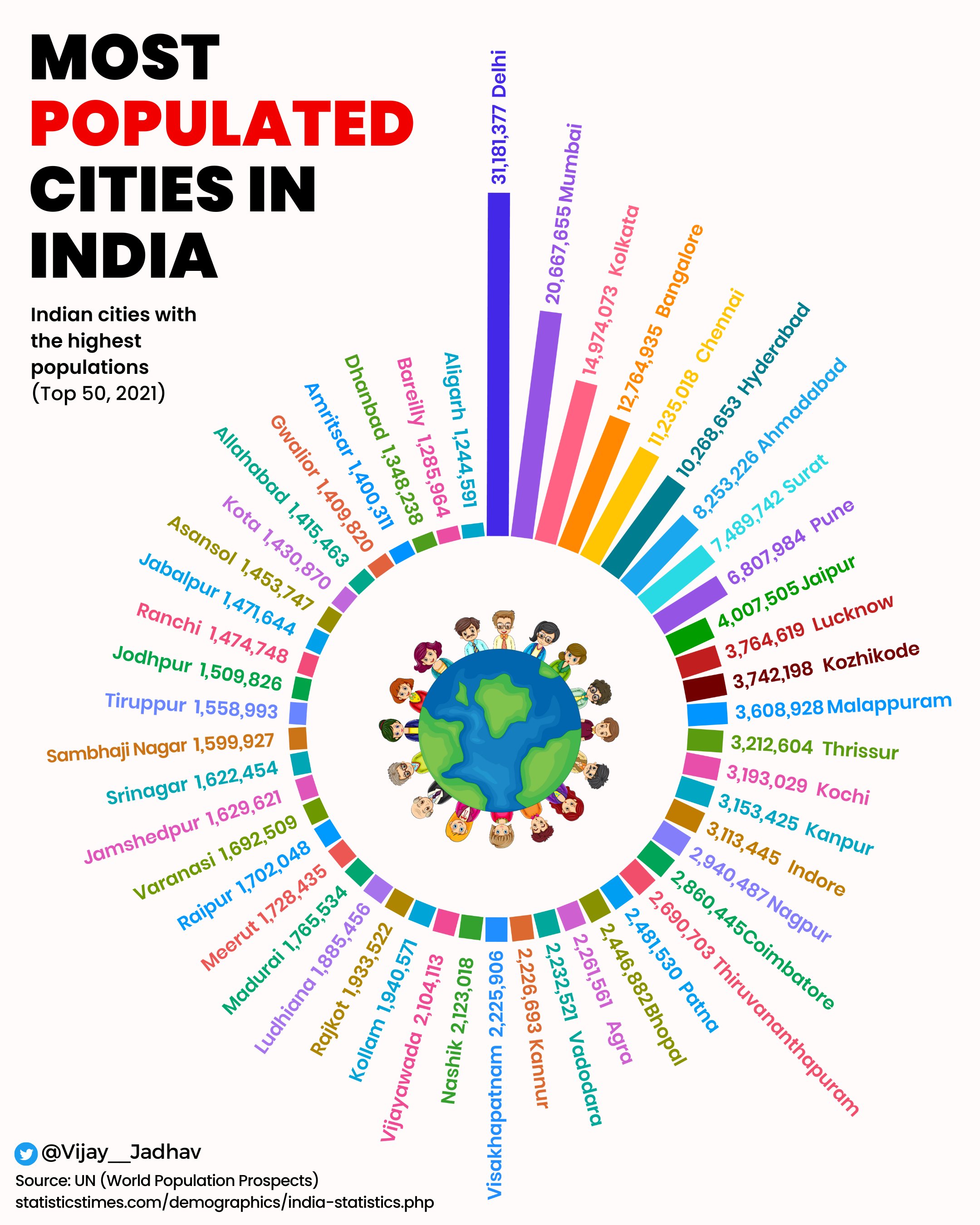
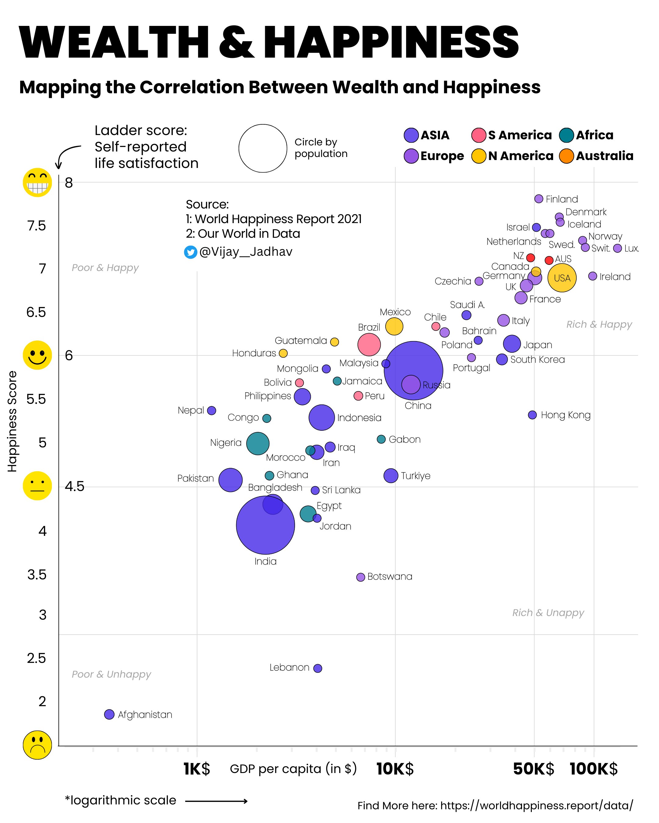
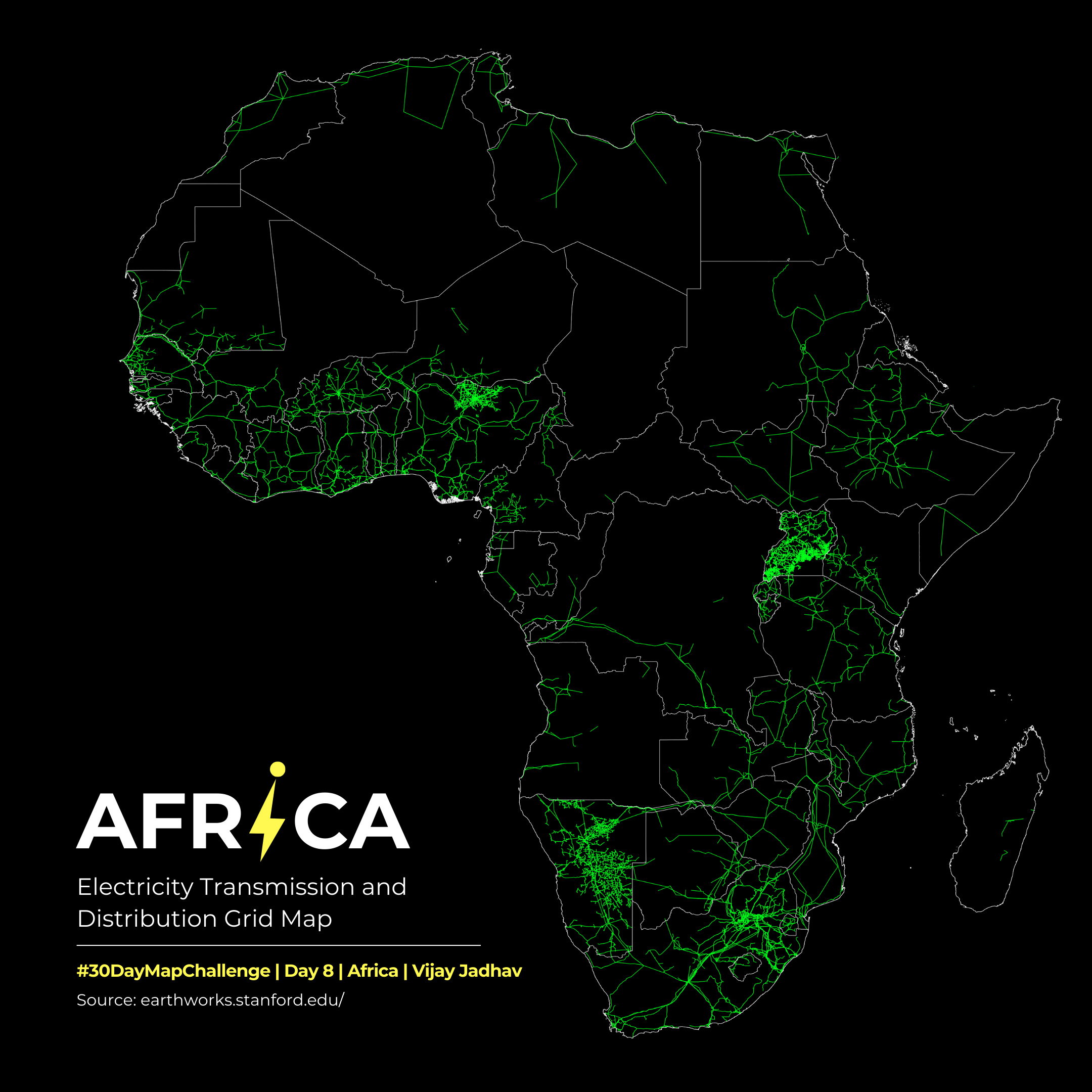
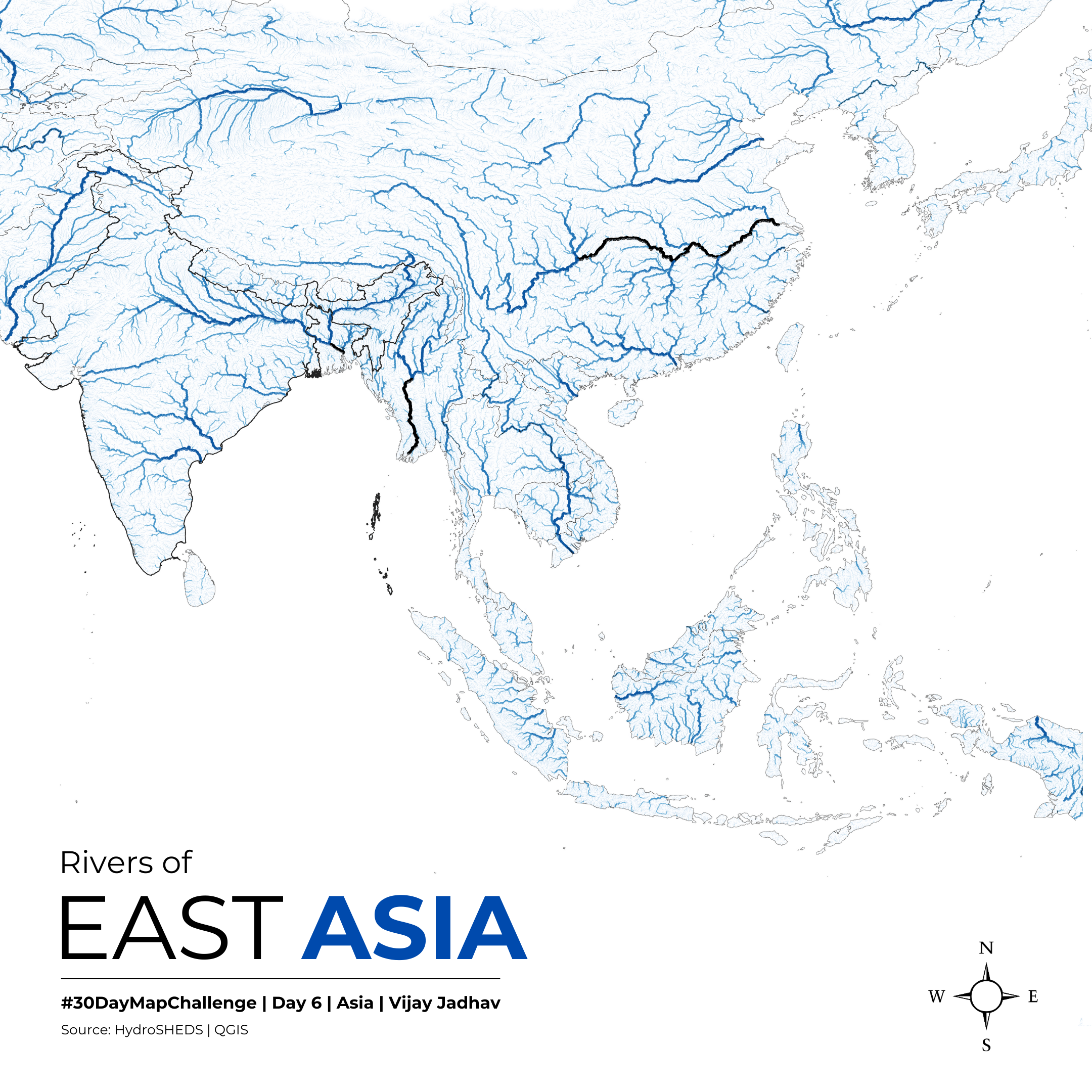
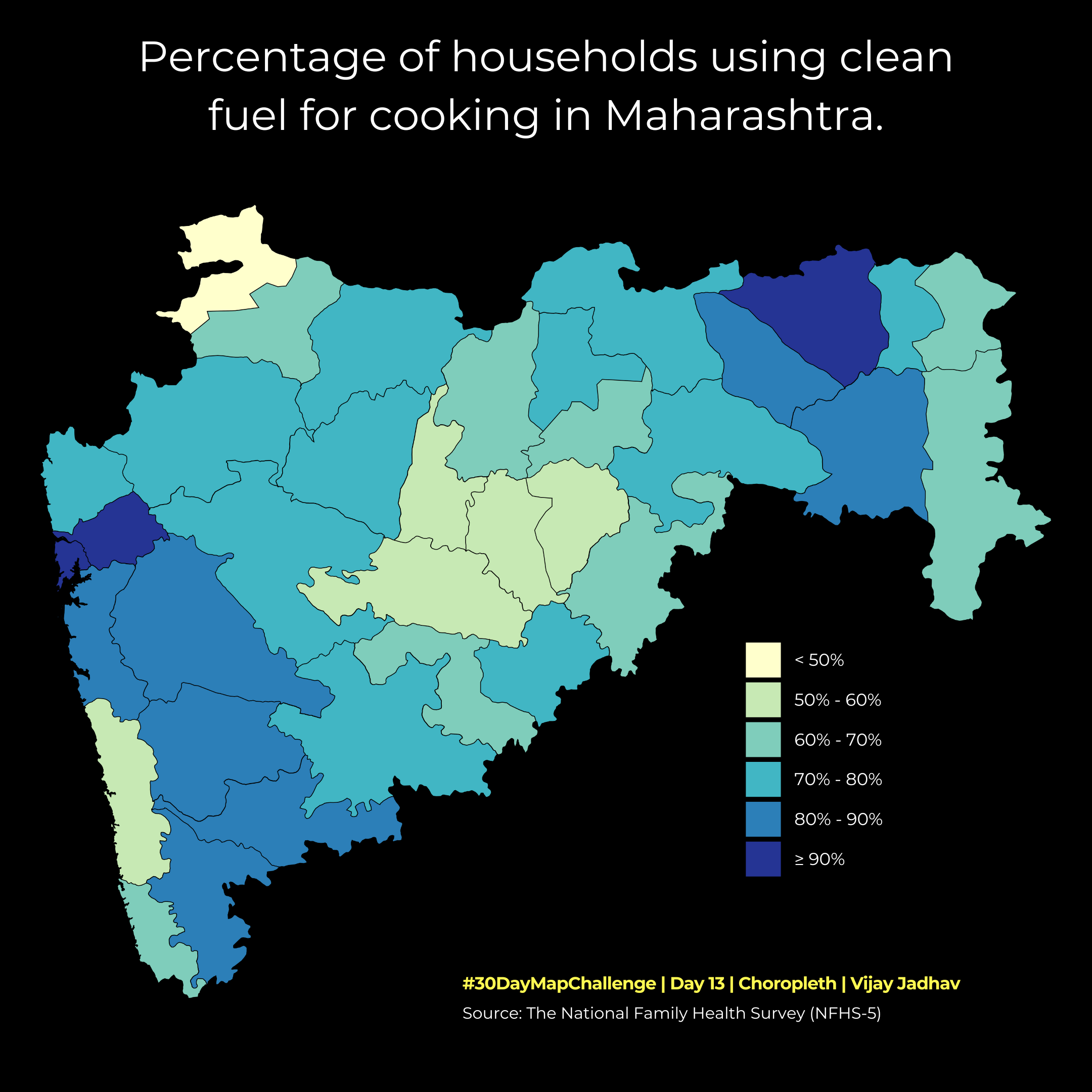
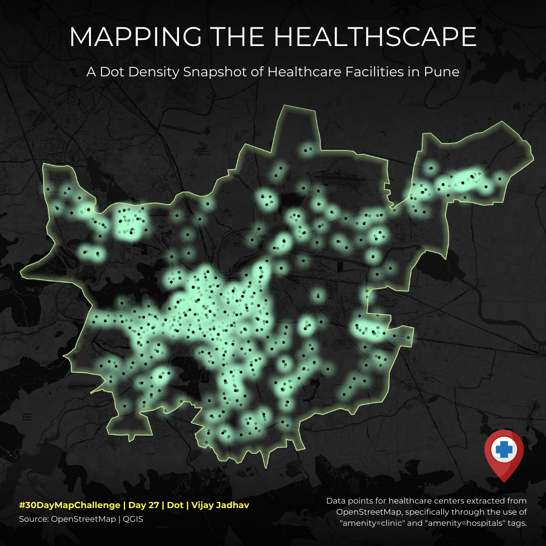
- Creating data-driven stories and visualisations on public policy, health and environment.
- Sourcing, cleaning and analysing government datasets to support evidence-based reporting.
- Designing charts and maps using Flourish, Datawrapper and QGIS for cross-platform publishing.
- Designed data-driven visualisations for digital platforms, improving content accessibility.
- Executed social media and digital marketing campaigns that grew brand awareness.
- Built audience engagement plans from data insights, optimising campaign effectiveness.
- Managed social presence for Sakal, SaamTV, Sarkarnama and Gomantak.
- Designed infographics on trending topics, increasing reader interaction.
- Used Google Analytics to track behaviour and develop data-driven content strategies.
Let's Talk
Working on something at the intersection of data, maps and public interest journalism? I'd love to hear about it.
Vijay Jadhav
I work as a Data Journalist at IndiaSpend and report stories using data. Most days are spent working with datasets, cleaning numbers, checking sources, and turning large tables into charts, maps, and visual explainers. The aim is to make information easier to understand.
Data visualisation is a big part of the work. It helps ask better questions and spot patterns that text alone often misses. Most stories use public data and government reports. These documents rarely speak clearly unless they are read carefully.
Earlier work in newsroom and social media roles helped build an understanding of how stories move across platforms, how visuals shape attention, and why clarity matters more than style.
There is a line by Bob Dylan that often fits data work well. "You don't need a weatherman to know which way the wind blows." Good datasets usually point somewhere. The job is to notice it and follow it honestly. (Also, if you love Bob Dylan, we are best friends by default.)
Something similar comes through when Arthur Morgan from RDR2 said, "I'm just trying to do the best I can." That is mostly what the work is about. Being careful with data, staying honest with the numbers, and letting the story come through on its own.